8 Minimalist Above Sofa Wall Ideas That Feel Clean & Balanced
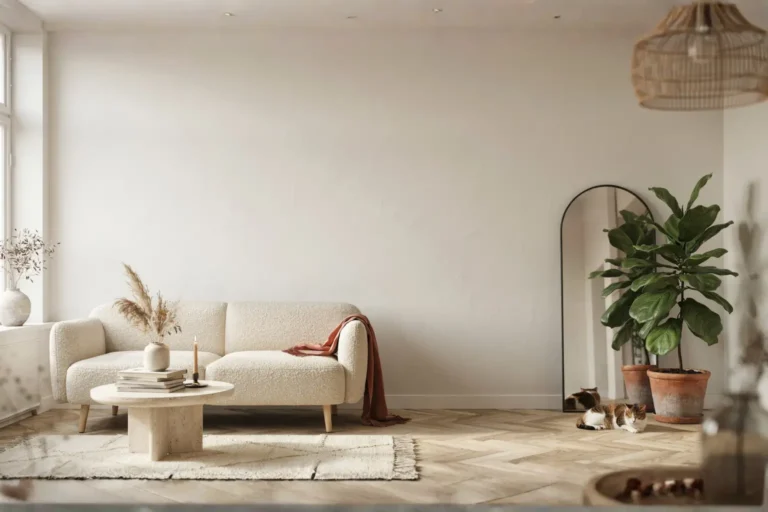
The wall above a sofa is one of the most searched, most stressed-over surfaces in the entire home. It is also one of the most frequently overdone. Too many pieces. Too much going on. A wall that tries to say five things at once and ends up saying nothing at all. Minimalism, in this specific context, is not about emptiness for the sake of it. It is about choosing one clear idea and executing it with enough confidence that the rest of the room exhales.
The sofa is already a dominant piece of furniture. It carries visual weight, physical presence, and usually a strong horizontal line. Whatever goes above it needs to work with that line, not fight it. Scale matters, proportion matters, and the breathing room between the top of the sofa and the bottom edge of whatever you place above it matters more than most people realize. Interior designers commonly follow the two-thirds rule: whatever occupies that wall should span roughly two-thirds of the sofa’s width. Not wider, rarely much narrower.
The eight ideas here cover a range of approaches, from a single statement canvas to a deliberate surface treatment, each one rooted in restraint, spatial balance, and the kind of visual calm that minimalist living rooms are actually built around.
1. One Wide, Horizontal Canvas in a Muted Palette
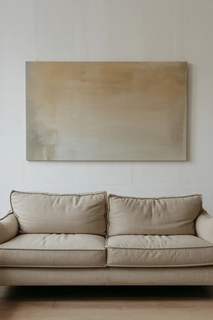
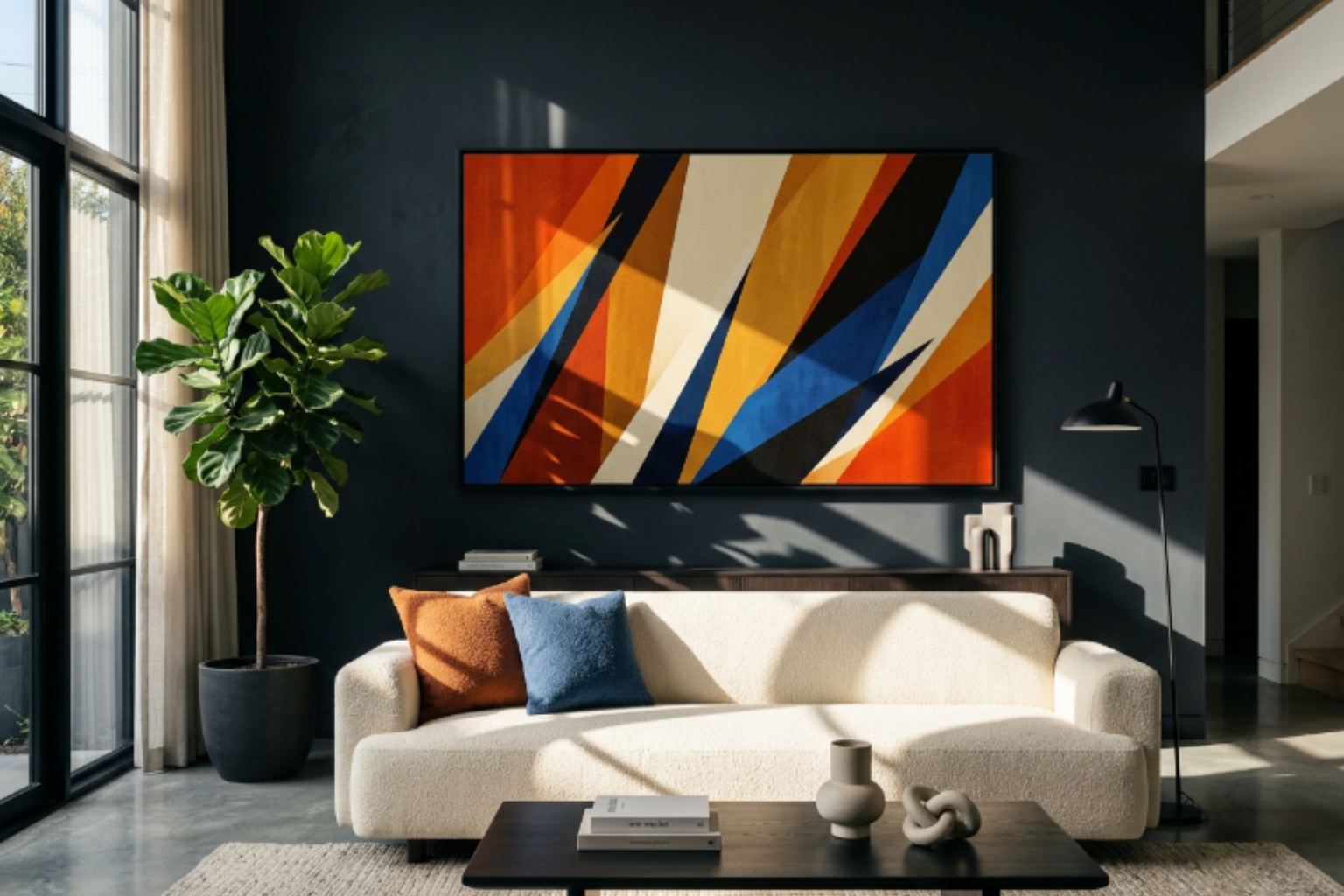
The most direct way to honor the horizontal line of a sofa is to echo it deliberately. A single wide canvas, proportioned to roughly two-thirds the sofa’s width and oriented in landscape format, creates an immediate sense of visual harmony that grouped arrangements rarely achieve. There is no tension between pieces, no decision about spacing, no concern about whether the left frame aligns with the right. One object, one wall, one clear intention.
The subject and palette of the canvas carry the whole idea, so both deserve careful thought. For a minimalist room, large abstract washes in warm stone, pale sage, or cool grey work harder than representational images. Up close, a canvas with visible brushwork has a tactile quality you can almost feel from across the room, the slight ridges of dried paint catching any directional light and creating a surface that shifts subtly between morning and afternoon. In flat overcast daylight, the texture reads quietly and evenly. When a low afternoon sun comes in from the side, those same ridges cast tiny shadows and the surface suddenly feels three-dimensional in a way that is genuinely surprising for something so simple.
Hang it 8 to 10 inches above the sofa’s top edge, centered on the wall behind. Leave the surrounding wall completely bare. The negative space on either side of the canvas is not wasted wall, it is what keeps the composition breathing.
2. A Single Line Drawing in a Thin Frame
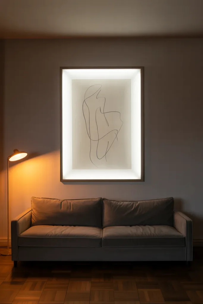
Abstract line art, the kind drawn in one continuous fluid gesture, has become one of the defining visual signatures of minimalist interiors. A single face rendered in a few unbroken lines. A figure in motion. A botanical form reduced to its essential curve. These pieces carry enormous presence for their visual simplicity, and that paradox is exactly what makes them work above a sofa.
The frame choice is critical and often underestimated. A thin metal frame in matte black or brushed brass lifts the drawing without adding visual weight. A thick ornate frame would completely undo the restraint the artwork itself is trying to communicate. The mat should be generous, at least two to three inches of white space surrounding the image, so the line has room to breathe within the frame before the wall takes over. That layering, drawing, mat, frame, wall, creates a sense of considered depth even though the piece itself is essentially just a line on paper.
The paper quality tells a story up close. A print on heavy cotton rag paper has a slight tooth, a gentle surface texture you notice when you stand near it. A standard photo print on glossy paper looks flat by comparison and picks up unwanted glare in afternoon light. The matte surface of quality art paper absorbs light evenly, which means it looks equally composed at noon under harsh overhead lighting and at night under the warm glow of a floor lamp nearby.
3. A Pair of Identically Framed Vertical Prints, Symmetrically Placed
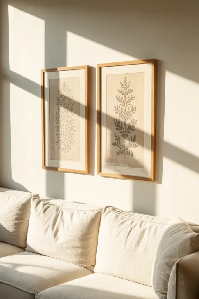
Symmetry in minimalist design is not a weakness. It is a tool, and above a sofa it works particularly well because it reinforces the centered, grounded quality the furniture already has. Two prints, same subject matter or same visual series, same frame, same mat, placed at equal distance from the sofa’s center point create a composition that reads immediately as intentional.
The subject matter should be quiet. Botanical studies in graphite. Architectural details photographed in black and white. Simple geometric studies in two tones. The point is that both prints belong to the same visual language so clearly that the eye registers them as a unit rather than two separate objects. The gap between them should be narrow, roughly 4 to 6 inches, narrow enough that the pair reads as one composed arrangement from across the room but wide enough that each print retains its individual presence up close.
What makes this idea feel minimalist rather than traditional is the restraint in the framing. Identical thin frames, no moulding, no ornament. And critically, nothing else on that wall. The temptation to add a small object between the two prints, a small wall hook, a tiny shelf, must be resisted entirely. The composition is complete as two. Adding a third element, however small, breaks the logic the symmetry was building.
4. Triptych of Oversized Smoked Glass Panels
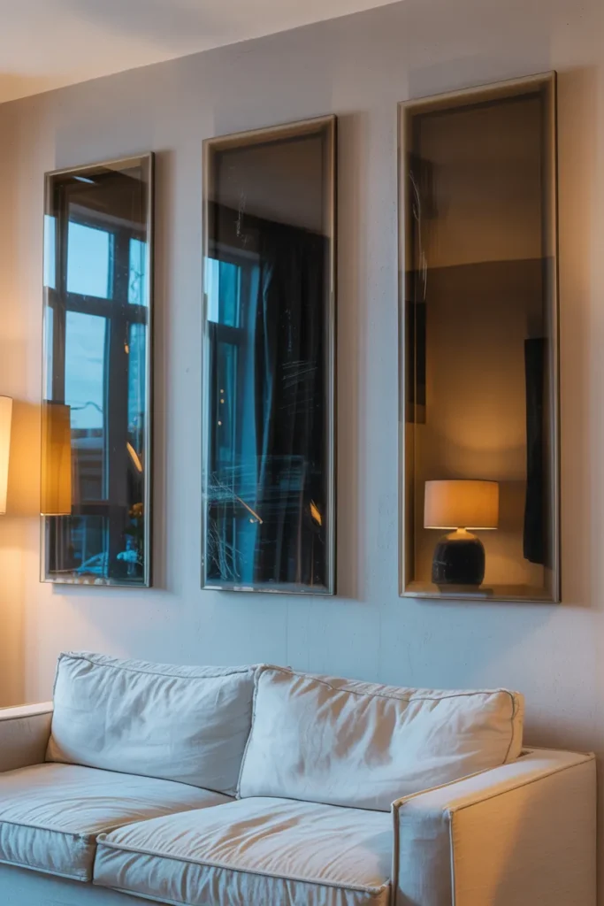
Instead of a single mirror, a series of three large, vertical panels made of smoked glass provides a moody, sophisticated focal point. The glass has a deep charcoal tint that reduces sharp glares and turns reflections into soft, hazy silhouettes. It feels cold and substantial, sitting about an inch off the wall on hidden spacers.
Visually, the smoked glass creates a sense of infinite depth. You will see the reflection of the rest of the room as a dark, elegant shadow. In the evening, the glass catches the warm glow of floor lamps, creating a beautiful, low-contrast light play. The reality of glass is that it shows the world as it is: you might see a faint streak from a cleaning cloth or a thumbprint near the edge where someone touched it. It is a clean, architectural look that doubles the light in the room without the “bathroom” feel of a standard mirror.
5. Two Minimalist Wall Sconces as the Sole Wall Feature
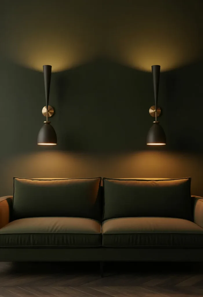
Lighting above a sofa is most commonly dismissed as a purely functional consideration, which is why using a pair of wall sconces as the primary and only wall feature creates such a strong visual impression. The sconces become the art. Their silhouette, the quality of light they throw at night, and the shadow patterns they cast on the wall behind them do work that no hung canvas achieves.
Choose sconces with genuinely sculptural form. A slender curved arm in matte black with a small open shade. A ceramic shade in an off-white glaze with slight finger marks visible from the hand-throwing process. A simple brass tube that directs light both upward and downward. The physical object needs to hold the eye in daylight, when the light is off and the sconce is simply a shape on the wall. At night, the picture changes entirely. A sconce throwing warm light upward creates a soft wash on the wall above it, a gentle gradient from bright to nothing that gives the wall behind the sofa depth and warmth that daylight never provides. The same wall that looked flat and bare in the afternoon becomes atmospheric and grounded at 9:00 PM with only the sconces on.
Space them symmetrically, roughly one-third in from each end of the sofa. The wall between them stays completely empty. That empty center, lit indirectly by the sconces on either side, is the focal point, not the sconces themselves.
6. A Large-Format Black and White Photograph, Unframed or Simply Mounted
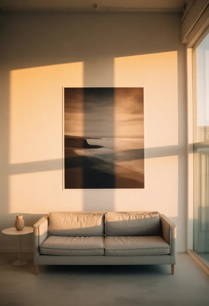
A single large-format photograph, printed at 40 inches or wider and either mounted directly on a backing board without a frame or displayed in the thinnest possible floating frame, brings a different quality to the wall than any painted canvas. Photography carries specificity. A landscape. An architectural detail. A close crop of a natural texture like weathered stone or rippled water. Whatever the subject, the image is grounded in something that actually existed in the world, and that quality reads in the room.
The absence of a frame is a deliberate choice worth considering seriously. A print mounted directly on a rigid backing with no frame at all sits flush against the wall and creates a slightly different reading, more like a window into a scene than an object on a wall. The edges of the print are visible, sometimes slightly imperfect where the print wraps or meets the board, and that small imperfection is honest in a way that a perfectly framed piece is not. Dust will settle on the top edge of the backing over time, a thin grey line that appears after a few weeks and requires a dry cloth every so often.
For a minimalist above-sofa placement, a black and white image works harder than a color photograph because it removes one layer of visual decision-making. The composition, tonal range, and subject carry the entire image without color competing for attention. In bright afternoon light, the highlights of the print can read almost white while the dark tones hold their depth. Under a warm lamp at night, the highlights shift slightly golden and the whole image softens.
7. A Thin Horizontal Shelf Styled with Three Objects Maximum
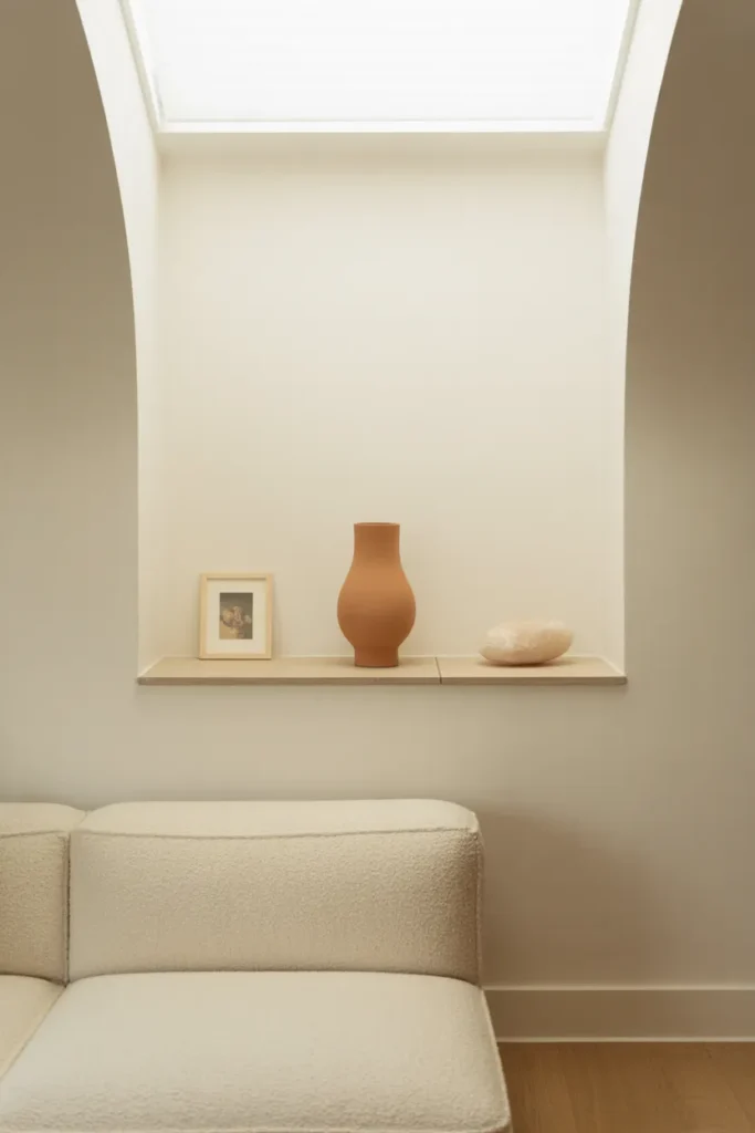
Before clarifying: this is not a floating wood shelf in the generic sense that the blacklist covers. This is a specifically proportioned, wall-integrated ledge, painted or finished to match the wall exactly so it reads as part of the architecture rather than something added to it. The shelf disappears into the wall, and the three objects on it float in front of the surface rather than sitting on a visible piece of furniture.
Three objects is the maximum, and the restraint is the entire point. One tall ceramic vessel in a matte earth glaze. One small framed artwork leaning against the wall rather than hung. One object with an interesting silhouette, a smooth river stone, a single dried branch, a glass object that catches light. The gap between each object should be generous, at least six to eight inches. The empty ledge between the objects is as important as the objects themselves, because it prevents the shelf from reading as a storage surface rather than a curated moment.
The shelf itself should sit roughly at the same height a traditional canvas would be hung, 8 to 10 inches above the sofa back. Its color matching the wall means that from across the room, you see only the objects, hovering at that height with no visible support, which is a clean and slightly unexpected visual effect. Up close, the shelf surface collects a fine layer of dust along its back edge where it meets the wall, a detail that is simply part of having horizontal surfaces in a real home.
8. A Vertical Washi or Handmade Paper Panel, Mounted Simply
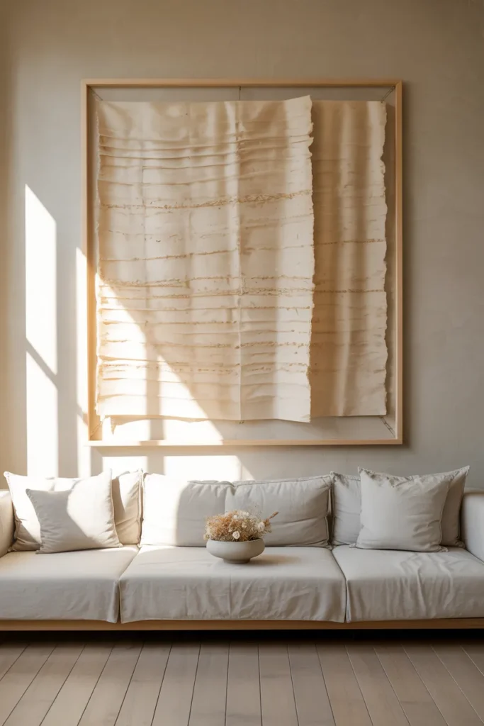
Handmade paper, the kind pressed by hand from natural fibers with visible inclusions of grass, petal, or bark, occupies an interesting space between textile and art. A single large panel of it, mounted behind glass in a simple frame or adhered directly to a backing board, brings texture and quiet visual complexity to the wall above a sofa in a way that printed art simply does not achieve. The surface is not uniform. It has thick and thin areas, places where the pulp gathered more densely, places where it thinned almost to translucency. Those variations become the visual content.
This works particularly well in rooms that already have natural material choices, linen upholstery, raw oak, unglazed ceramic. The paper panel adds another layer to that material conversation rather than introducing a competing visual language. A panel in warm cream or natural bone tone reads quietly in daylight, almost like a section of wall with unusual texture. In raking morning light, the variations in paper thickness suddenly become visible as gentle ridges and shadows, and the panel reveals a level of detail that flat afternoon light completely hides.
For above-sofa placement, a panel proportioned to roughly half the sofa’s width works better than trying to match the two-thirds rule that a wider canvas requires. The smaller scale of handmade paper, its inherently intimate quality, means it reads more comfortably at a slightly more modest size. The surrounding wall does the rest of the work, its blankness amplifying the presence of the panel rather than diminishing it.
Conclusion:
Eight ideas, and what they share is less about style and more about decision-making. Each one commits to a single clear choice above the sofa and then stops. No additions, no backup pieces filling the remaining wall space, no safety net of extra objects in case the main idea does not feel like enough. That restraint is genuinely difficult to hold, especially when a wall feels large and a single piece feels insufficient.
The measurement that matters most is the gap between the top of your sofa and the bottom edge of whatever you place above it. Keep it between 8 and 10 inches. Any closer and the arrangement feels crowded and slightly anxious. Any further and the connection between the furniture and the wall breaks, and both start to feel unanchored. Get that gap right first. Then choose one idea from this list, give it the full width and breathing room it needs, and leave everything else alone. The wall does not need more. It needs the right thing, placed with enough confidence to let it stand on its own.