8 Minimalist Hallway Wall Ideas That Feel Clean & Open
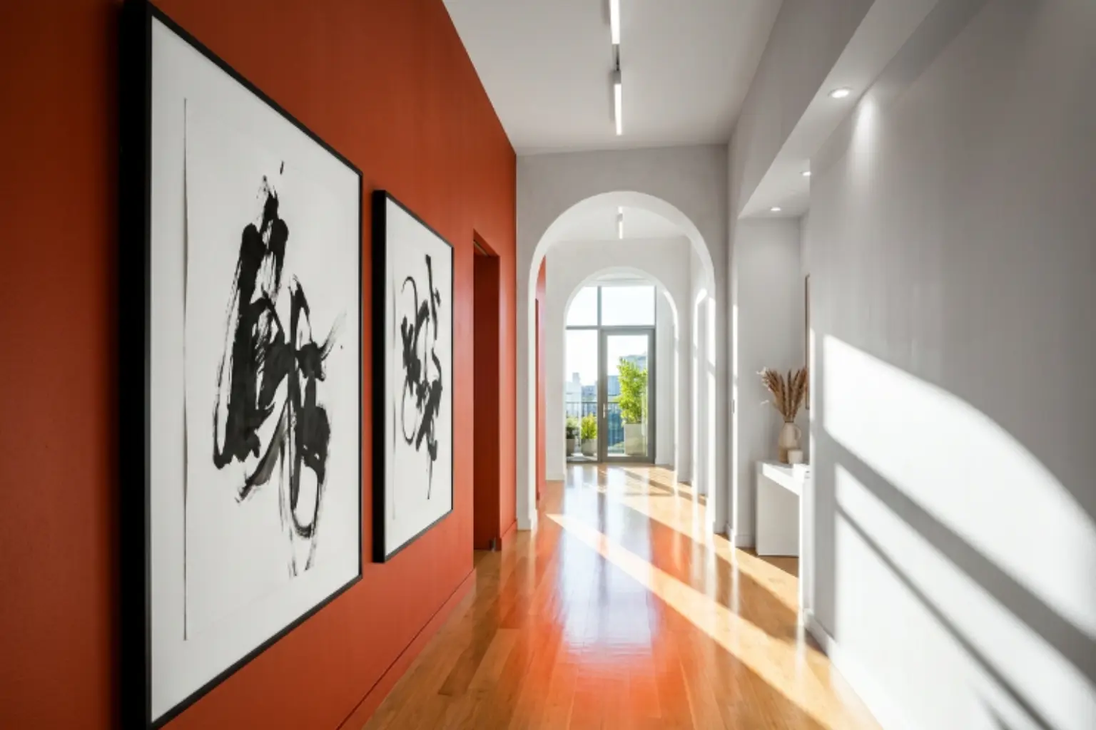
The hallway is the connective tissue of a home, yet it is often treated as a mere transition zone: a narrow passage to be rushed through. In interior styling, the challenge of a hallway is its restricted spatial balance. Because these spaces are typically long and thin, heavy décor can quickly make the walls feel like they are closing in. To create a hallway that feels clean and open, the focus must shift toward minimalist wall ideas that prioritize light, air, and rhythmic simplicity.
In a minimalist setting, every object carries more weight. When the walls are mostly bare, the eye naturally gravitates toward the fine details: the way a single piece of wood catches the morning sun or how a recessed light casts a soft gradient down a plaster wall. To avoid a sterile feel, we must integrate visual interest through authentic, real-world textures. From the subtle dust on a slim ledge to the faint, rhythmic sound of a door breeze passing a frame, these ideas use aesthetic inspiration to turn a narrow corridor into a serene, breathing part of the house.
1. Single Ultra-Slim Picture Ledge in Ash Wood
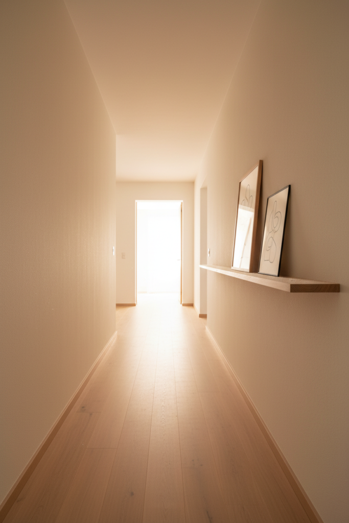
In a narrow hallway, a standard shelf is a physical obstacle, but a single ultra-slim ledge made of light ash wood provides a place for art without encroaching on the walkway. Ash has a pale, sandy tone with a tight grain that feels smooth and cool to the touch. It creates a sharp, horizontal line that draws the eye forward, lengthening the space visually.
The visual reality of a hallway ledge is its interaction with light. Since hallways often lack direct windows, the ledge relies on the spill of light from adjacent rooms. You will notice the wood grain looks more pronounced in the morning and softens into a flat, neutral strip by evening. A thin layer of dust inevitably settles on the flat surface, and you might see a tiny scuff on the wall just below the ledge where a frame was adjusted.
Because it is so slim, the ledge feels delicate. If you brush against it while carrying laundry, you will hear a light, wooden clack. It is a masterclass in spatial balance, offering a home for a few curated black-and-white prints while keeping the path entirely clear and open.
2. Recessed Glow Niche with Matte Plaster Finish
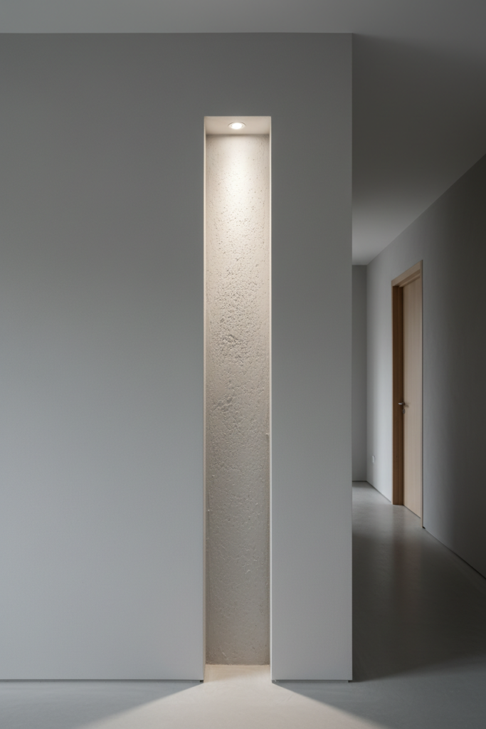
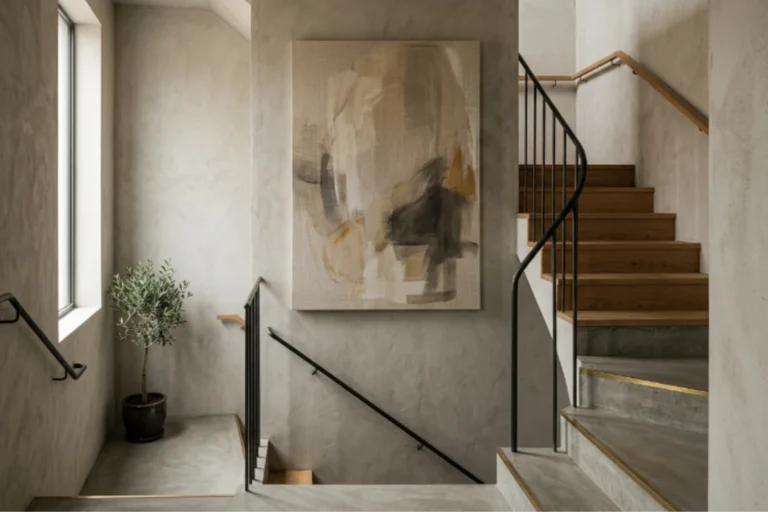
Architectural minimalism often involves taking away rather than adding. By carving a shallow, rectangular niche into the wall and finishing it in a matte, hand-applied plaster, you create a built-in focal point. The plaster is chalky and cool, showing the very faint ridges of the trowel used to apply it.
This idea is all about the glow. By hiding a small LED strip at the top of the niche, the light washes down the textured plaster, creating a soft, hazy gradient of shadow. You will not see the light source, only the effect. In the midday sun, the niche looks like a deep, quiet void, but at night, it provides a warm, architectural guiding light for the hallway.
The imperfection here lies in the plaster itself; you might see a tiny hairline crack or a spot where the pigment is slightly darker. It does not reflect light: it absorbs it. This wall design choice makes the wall feel thick and intentional, turning a transition space into a permanent piece of the home’s structure.
3. Vertical Row of Mismatched White Ceramics
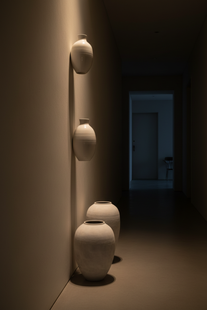
To add visual interest without introducing heavy colors, hanging a vertical row of three or four mismatched ceramic vessels: all in shades of white or cream: creates a sculptural wall. These ceramics have different finishes; one might be a shiny, glassy crackle glaze, while another is a rough, unglazed bisque.
The light play is subtle but effective. The glassy ceramic will catch a sharp, tiny glint from a nearby light bulb, while the unglazed one will show a soft, blurry shadow. You can feel the weight and the temperature of the clay: it stays cool even in a warm house. You might notice a tiny pinhole in the glaze or a slight wobble in the shape, confirming its handmade origin.
These pieces act as subtle acoustic diffusers, breaking up the flat surface of the hallway wall. They are mounted on hidden hooks, making them look like they are hovering. It is a clean, quiet look that prioritizes interior design through form rather than color, keeping the hallway feeling airy.
4. Oversized Framed Void Photography
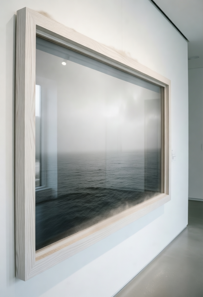
Minimalism often uses large-scale art to make a small space feel bigger. A single, oversized frame featuring void or minimalist photography: such as a single horizon line or a vast, foggy landscape: creates a visual exit point for the hallway. The frame is typically a thin, white oak that blends into the wall.
The visual reality is the vastness of the image. Because the subject matter is so simple, the eye focuses on the glass of the frame. You will see the reflection of the hallway stretching behind you, which effectively doubles the perceived width of the space. You might see a faint streak from a cleaning cloth or a thumbprint on the edge of the frame.
The frame feels solid and heavy. In the afternoon, the sun might hit the glass at an angle, sending a bright, rectangular reflection onto the floor. This wall styling choice provides a sense of breathing room, giving the mind a place to rest as you move from one busy room to another.
5. Linear Brass Stitch Wall Hooks
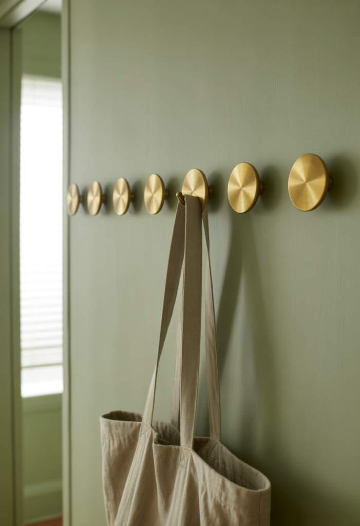
For a hallway that needs to handle coats or bags without looking cluttered, a series of five or six tiny, linear brass hooks arranged in a perfectly straight line acts as a functional stitch in the wall. The brass is not shiny: it is a brushed, matte metal that feels heavy and cold. Over time, it will develop a slight tarnish where fingers touch it most often.
Visually, these hooks create a rhythmic, dotted line along the hallway. When they are empty, they look like small golden architectural details. When in use, the items hanging from them: a linen tote or a light trench coat: add a soft, organic layer to the minimalist space. You might see a small scuff on the wall behind the hook from a metal zipper or a key ring.
The sound of a heavy coat being hung is a dull, metallic tink. These hooks are small enough that they do not break the visual flow of the wall, maintaining the spatial balance of the corridor. It is a practical solution that respects the clean and open philosophy of the home.
6. Tonal Slatted Wood Feature Panel
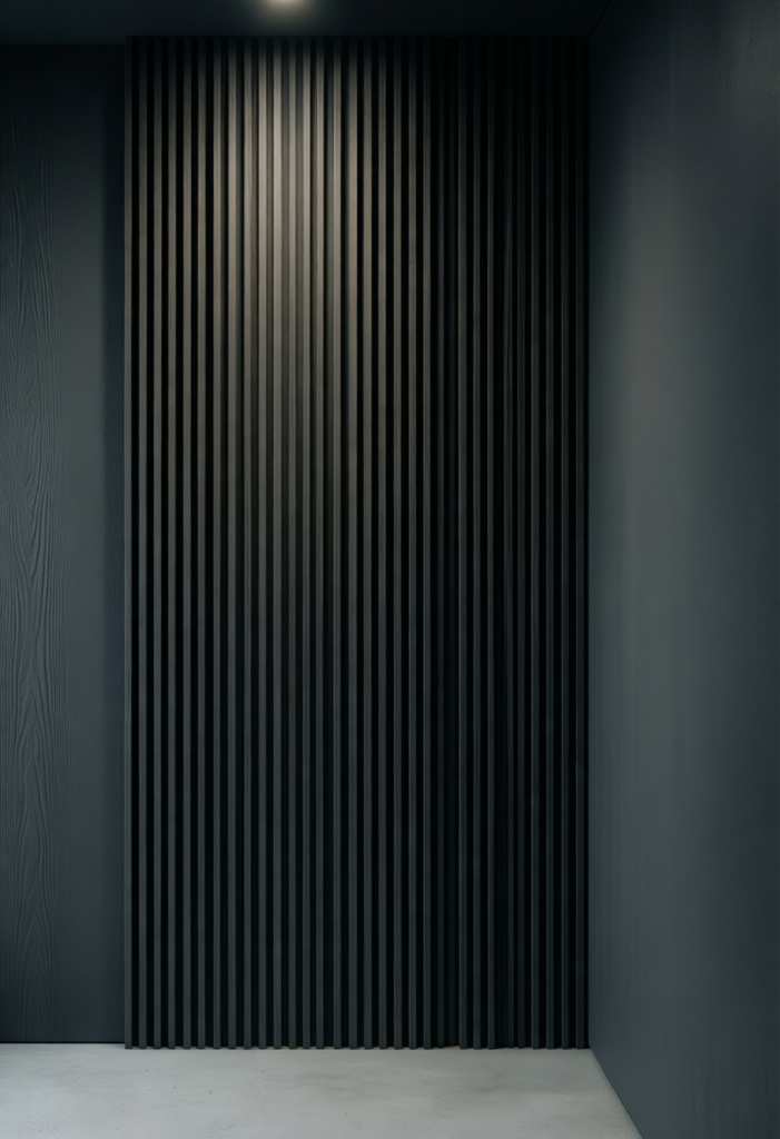
If the hallway feels too long and monotonous, a single vertical panel of thin, slatted wood in the same color as the wall can provide texture without visual clutter. Usually made of pine or oak, these slats create a series of deep, vertical shadows that make the wall feel like it has more dimension.
The wood feels warm compared to the plaster. If you run your hand across it, you feel the rhythmic bump of the slats and the grain of the timber. In the late evening, the shadows between the slats become pitch black, creating a high-contrast architectural look. You might notice a tiny bit of wood glue visible in a joint or a small knot in the wood, making it feel grounded and real.
This interior design element breaks the tunnel effect of a long hallway. Because it matches the wall color exactly, it does not scream for attention: it simply adds a layer of sophisticated aesthetic inspiration that reveals itself as you walk closer.
7. Minimalist Metal Line Wall Sculpture
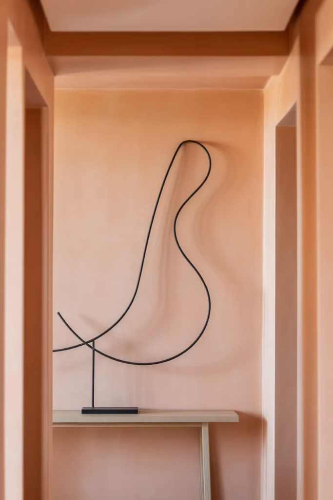
A single, continuous-line sculpture made of thin black wire or wrought iron provides an airy, floating focal point. It might represent a face, a leaf, or an abstract wave. The metal is thin enough that it does not block the view of the wall, maintaining that open feel.
The visual beauty here is the shadow. Because the sculpture sits an inch away from the wall, it casts a perfect, slightly blurred shadow that moves as the lighting changes. If a window is open, the sculpture might vibrate slightly, making the shadow dance. You will see the small, black mounting screws that hold it in place.
It is a quiet, intellectual piece of wall art. It stays cool to the touch and has no scent. This choice adds a high-end designer touch to the hallway while ensuring the spatial balance remains light and unburdened.
8. Oversized Vertical Framed Mirror with No Bevel
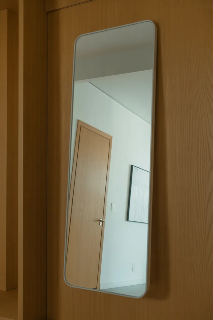
To maximize the feeling of an open hallway, a single, floor-to-ceiling vertical mirror with a hidden or ultra-thin frame is the ultimate tool. By choosing a mirror with no bevel, the reflection looks seamless and deep, like a doorway into another room.
The visual reality of a large mirror is that it shows everything: the dust at the base, the faint smudges where a hand touched it, and the reflection of the messy room at the end of the hall. But it also doubles the light. In the morning, it catches the sun and throws it into the darker corners of the house.
You will feel the temperature drop when you stand near it, as the glass stays cold. This interior styling choice is less about décor and more about atmosphere, effectively deleting the walls and making the hallway feel like a grand, open gallery.
Conclusion
Creating a minimalist hallway is an exercise in restraint. In a space that is often narrow and overlooked, the goal is to choose elements that facilitate movement rather than hindering it. When you focus on light-reflective materials like glass and ash wood, or architectural details like recessed niches, you are not just decorating a wall: you are changing the way the air feels in your home.
Minimalism does not mean perfection. The beauty of these spaces is found in the lived-in details: the faint reflection in a mirror, the dust on a high ledge, or the way a shadow stretches across a textured plaster wall at sunset. These small, authentic moments prevent a clean space from feeling cold. By prioritizing spatial balance and visual interest, you can turn a simple transition zone into a serene corridor that makes the rest of your home feel even more expansive