
9 Empty Wall Ideas That Actually Look Good
Most people notice their empty walls on a Sunday morning, when the light comes in flat and unforgiving, and suddenly every bare stretch of plaster looks like a problem that needs solving. But that impulse to fill a wall fast, to just grab something and hang it, is almost always how a room ends up feeling random rather than considered. An empty wall is not a design failure. It is, honestly, the clearest opportunity you will ever have to make a deliberate choice.
The ideas in this article are not about covering space for the sake of it. Each one is about creating something that earns its place on the wall. Something that still looks intentional three years from now, after the novelty wears off and the dog has bumped into it twice. Whether the room is a narrow hallway bathed in cold northern light, or a wide living room that catches golden-hour warmth every evening, there is a placement approach here that will actually hold up in real life, with real dust, real scuffs, and real people moving through it every day.
1. A Single Oversized Canvas, Hung Low and Off-Center
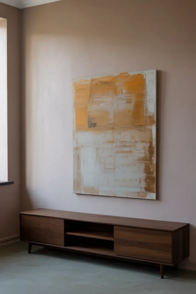
The conventional instinct is to center a piece of art on a wall and hang it at eye level, which is sound advice for a museum and mediocre advice for a home. When you take one large canvas, something at least 40 inches across, and deliberately push it off-center by eight or ten inches, the wall immediately feels curated rather than decorated. The asymmetry creates visual tension that a symmetrical arrangement never achieves. It suggests that someone made a choice, not just followed a rule.
The canvas itself does not need to be expensive, but it does need presence. A large abstract piece with muted earth tones, ochre dragged through cream, or charcoal smudged over raw linen, reads well in almost any light. At 6:00 AM, the cool flat light will reveal the texture of the brushwork, the ridges of paint, the faint imperfections in the canvas weave. By late afternoon, that same surface catches warm raking light that makes the brushstrokes look almost three-dimensional. The painting will look like a different object at different times of day, which is exactly what you want from a focal point.
Hang it with the bottom edge roughly 12 inches from any adjacent furniture. The slight gap anchors the piece without making it feel like it was measured with a ruler. Leave the remaining wall space genuinely empty. That breathing room is doing work, creating spatial balance that a crowded arrangement would destroy.
2. Limewash or Plaster Treatment as the Decor Itself
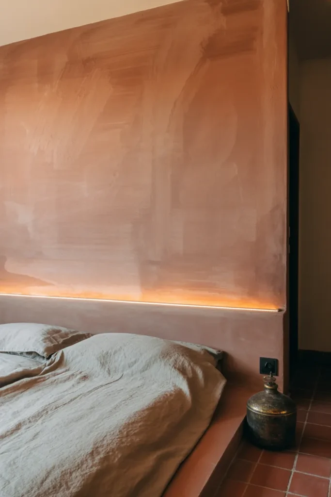
There is a school of thought that says the answer to an empty wall is not something you hang on it, but something you do to the surface itself. Limewash paint, applied by brush in overlapping, slightly uneven strokes, creates a finish that is visually rich enough to need nothing else placed in front of it. It is not a flat color. It is a layered, breathing surface with depth you can actually see shift depending on where you stand.
Run your hand across a properly done limewash wall and it feels slightly chalky, almost powdery, with a faint graininess that no standard paint achieves. The color itself seems to move, lighter in some patches, slightly deeper in others, because the application is intentionally imperfect. Those variations are the point. In a bedroom, a single limewash wall in dusty terracotta or aged sage becomes the entire design statement. The room does not need anything else on that surface because the surface is already doing the visual work.
This works particularly well in rooms that lack architectural character, rentals with builder-grade drywall, or hallways that feel like corridors rather than spaces. A limewash treatment gives the wall a sense of history it never actually had. Over time, slight scuffs and marks actually add to the aged character rather than looking like damage, which is a rare and useful quality in a finish.
3. A Grid of Botanical or Scientific Prints in Matching Frames
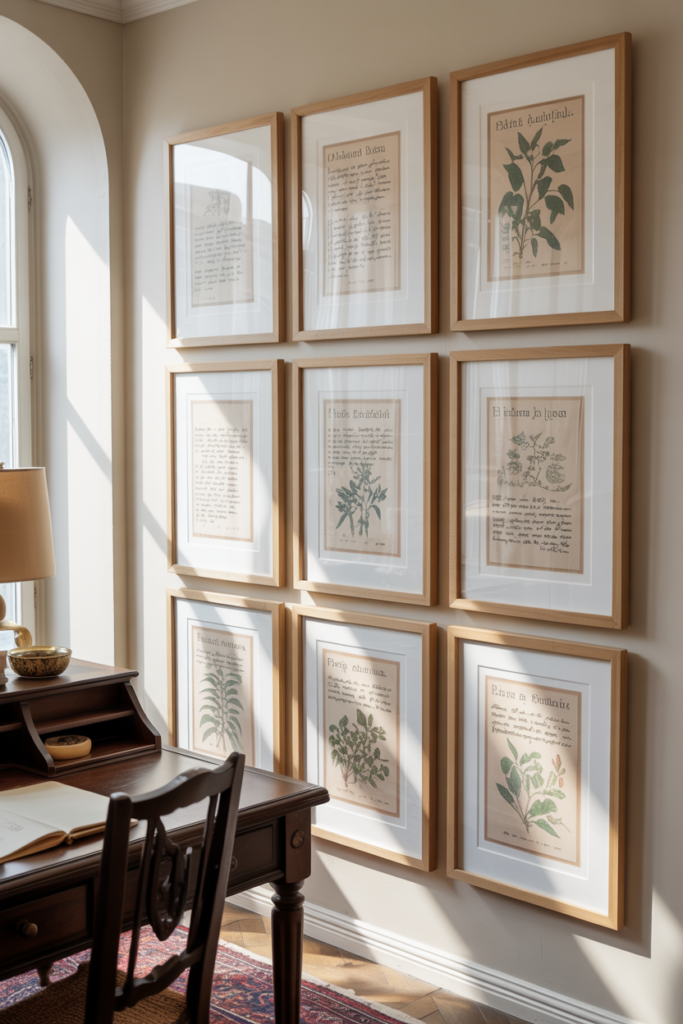
This is as close to a gallery wall as this article will go, and the distinction matters. A standard gallery wall is a casual mix of frames, sizes, and subjects that tends to look effortful and slightly chaotic. A tight, uniform grid of matching frames is the opposite. It reads as intentional, almost architectural. The grid itself becomes the design element, not the individual pieces inside it.
The subject matter makes or breaks this idea. Generic art prints feel generic. Botanical illustrations, the kind with handwritten Latin notations along the bottom margin, vintage anatomical drawings, or antique astronomical maps carry a quality of research and specificity that ordinary prints do not. Source them from estate sales, old encyclopedias, or archival print sellers. The papers will have slightly yellowed edges, foxing marks, and subtle variations in tone that tell the story of their age. That imperfection is what makes the grid feel collected rather than purchased as a set.
Keep the frames identical: thin black metal or natural oak are the most reliable choices. Mat the prints generously, with at least two inches of white mat showing around each image. A 3×3 grid of 8×10 prints in 12×12 frames creates a composed square arrangement that reads well on a mid-sized empty wall, providing aesthetic inspiration without overwhelming the room’s existing spatial balance.
4. A Sculptural Wall-Mounted Object That is Not Art
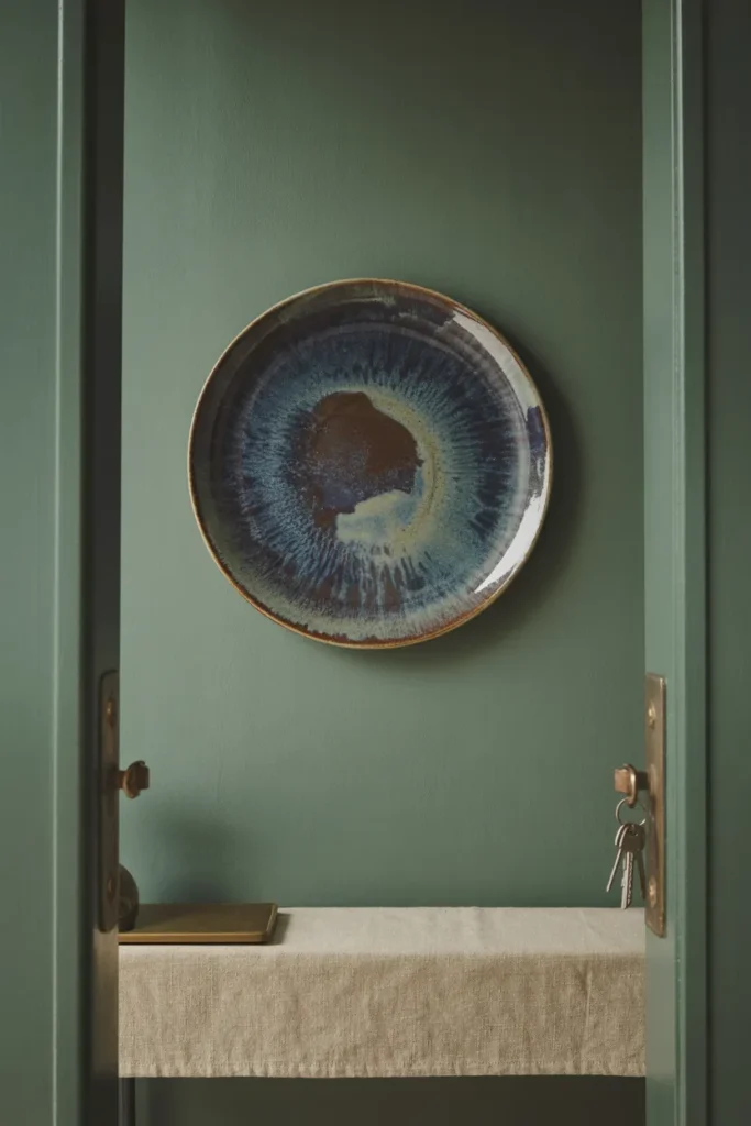
Most objects hanging on walls were designed specifically to hang on walls, which is part of why so many walls look the same. The more interesting approach is to mount something that was not originally intended as wall decor. A single large ceramic plate with an unusual glaze. An aged wooden architectural fragment salvaged from a demolished building. A cast-iron industrial gear found at a flea market. A hand-woven textile from a craft market, not a mass-produced tapestry, but something made by an actual person whose technique is slightly uneven in the most honest way.
The scale matters considerably. Whatever you choose, it should be large enough to command the wall without needing companions. A 24-inch diameter ceramic plate with a deep reactive glaze, where the color pools differently in each firing, becomes a focal point that no standard artwork easily matches. It is three-dimensional, so light interacts with it physically. The glaze surface catches morning light with a slight sheen and goes flat and matte by midday. You will notice it differently each time you walk past.
This approach rewards patience. These objects are found, not ordered from a catalog, and the search is genuinely part of the outcome. A piece you found at a ceramics market after looking for six months carries a different energy in a room than something that arrived in a branded box two days after you clicked buy.
5. Floor-Leaning Oversized Art
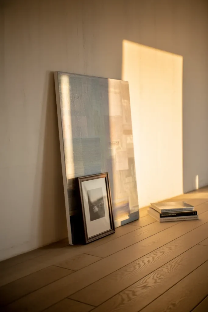
Hanging art requires a nail, a level, and a commitment that some walls, especially in rentals, simply do not allow for. But there is also a visual argument for leaning large pieces against the wall rather than hanging them. It looks deliberately unconventional, the way a working artist’s studio looks, where finished pieces are propped up because they are still being considered, not yet assigned a permanent place.
One large piece leaning against the wall, something at least 48 inches tall, commands a corner or a stretch of wall without the rigidity of a hung piece. Layer a smaller framed print in front of it, slightly to one side, and the composition immediately reads as considered and layered. The slight gap between the back of the large piece and the wall creates a thin shadow line that gives the arrangement a sense of physical depth. Dust will collect in that gap, which, practically speaking, means running a dry cloth back there every few weeks, but the visual result is worth the minor maintenance.
This works best in living rooms or bedrooms where the floor surface has some character, hardwood with visible grain, concrete with slight aggregate variation, or stone tile with natural veining. The art piece reaching from floor to mid-wall creates a strong vertical line that anchors the surrounding negative space and creates the kind of grounded, curated aesthetic that styled interior photography relies on heavily.
6. A Curated Arrangement of Wall Sconces Without Artwork
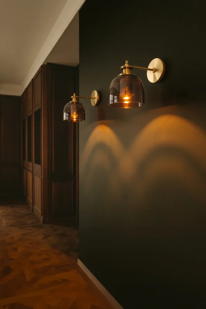
Lighting is rarely treated as wall decor in its own right, which is exactly why using a pair of wall sconces as the primary design statement on an empty wall feels fresh rather than obvious. Two sculptural sconces, placed symmetrically or deliberately asymmetrically, with interesting silhouettes, curved arms, smoked glass shades, or exposed Edison-style bulbs in aged brass fittings, can carry an entire wall without a single piece of art accompanying them.
The quality of the light they cast becomes part of the design at night. A smoked glass sconce throws a warm amber pool upward and downward while keeping the center of the shade dim and slightly mysterious. An open-cage sconce throws sharp shadows of the bulb filament against the wall behind it. These shadow patterns shift as the bulb warms up, the first few minutes after switching on producing a slightly cooler, thinner light before the filament settles into its full warm glow. That small shift is genuinely lovely, and most people who have only relied on ceiling lighting have never experienced it at wall level.
During the day, the sconces function as sculptural objects, particularly if they have interesting physical form. Choose fittings with some visual weight: a sconce that looks like a piece of forged ironwork or a ceramic shell with a hand-finished glaze will hold the eye even when the light is off, contributing to the wall’s visual interest across the full 24-hour cycle of a room.
7. A Vintage Plate Collection, Arranged with Actual Intention
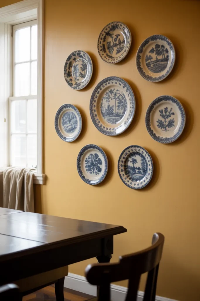
The idea of plates on a wall carries a lot of baggage, most of it associated with grandmother’s dining rooms and country-cottage kitchens from the 1980s. But the reason it keeps returning is that it actually works when it is done with genuine curatorial thought rather than just hanging whatever plates are available.
The difference between a plate wall that looks dated and one that looks considered comes down to restraint and coherence. Choose plates from a single era or a single color family. Six to eight blue-and-white transferware plates, all from the same approximate period but with different patterns, create a collection that feels unified but not matching. The slight variations in blue tone, some plates having a deeper cobalt while others read more slate, create a visual rhythm rather than a static repetition. The different pattern subjects, one showing a pastoral scene, another a geometric border, another a botanical motif, give the eye movement without confusion.
Mount them with proper plate hangers that sit flush, not the spring-coil variety that grip visibly and mar the rim. Leave breathing room between plates, at least four inches, so the wall surface between them becomes part of the composition. Over time, the plates will collect a thin film of kitchen or hallway dust in their recessed centers, which is simply the reality of living with objects. A soft dry brush handles it in minutes.
8. A Full-Height Bookcase Built Into or Placed Against the Wall
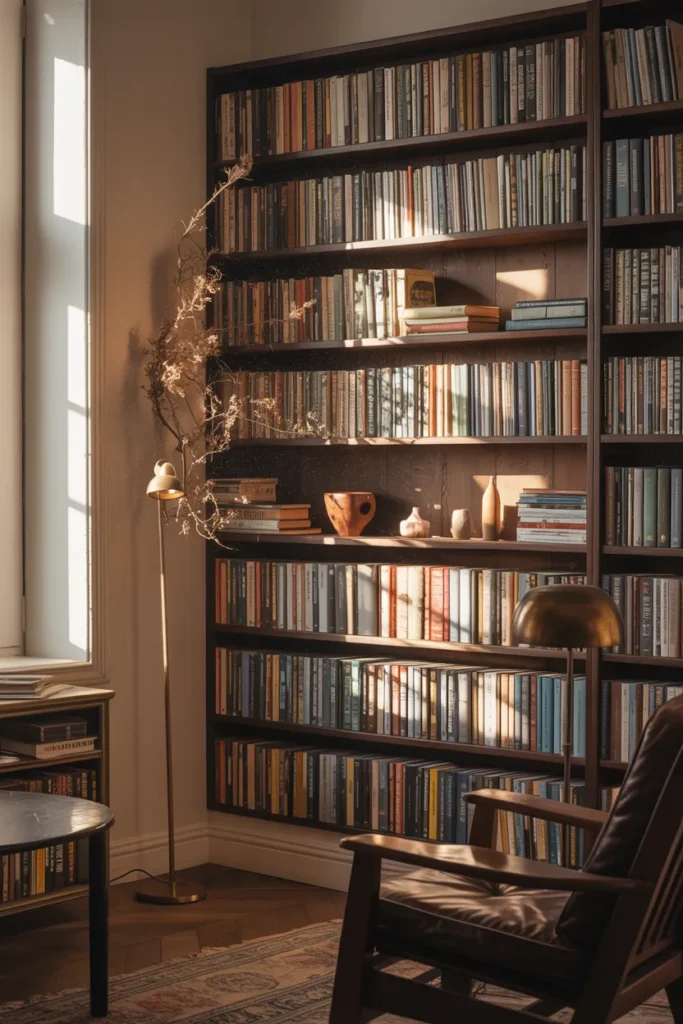
There is a meaningful distinction between a floating shelf, which is blacklisted here for good reason, and a full floor-to-ceiling bookcase that owns the entire wall. One is a surface. The other is a room within a room. A tall bookcase, whether it is a freestanding unit pushed flush against the wall or a built-in constructed with basic carpentry, changes the spatial balance of an entire room in a way that no hung object achieves.
The styling of the books and objects on it is where the real design work happens. Books arranged by color create visual order that photographs beautifully but can be maddening to actually use. Books arranged by subject or size, with occasional small objects placed in front of them, a small ceramic vessel, a single dried branch, a smooth stone, feel more honest. The slight lean of a paperback that has been read many times, the way a hardcover’s spine cracks slightly after years of opening, the dust that settles on the upper edges of the top shelf and turns slightly grey: these are the marks of a bookcase that actually lives in a home.
At 6:00 AM, a east-facing bookcase will catch early light across its spines and show you colors and textures the mid-afternoon overhead light completely flattens. That variation is a good reminder that every object in a room performs differently across the day, and a bookcase is one of the richest surfaces you can give a wall.
9. A Hand-Drawn or Hand-Painted Mural, Even a Small One
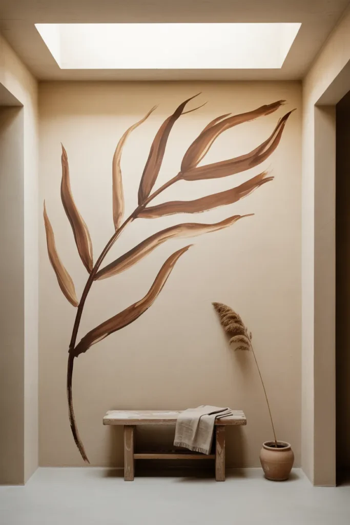
The word “mural” triggers an assumption of scale and complexity that puts most people off immediately. But a mural does not have to cover an entire wall or require professional artistic skill. A single painted branch, done in a flat earth tone directly on the plaster, starting from one corner and reaching across perhaps four feet of wall, is a mural. A geometric pattern hand-painted in two colors across a small section of a hallway wall is a mural. The defining quality is not size, it is the directness of the mark on the surface.
What makes a hand-painted element on a wall feel authentic rather than amateurish is the deliberate acceptance of imperfection in the line. A straight line painted freehand with a small artist’s brush will have slight variations in width. The paint will thin slightly in one section and run slightly thick in another. These variations are visible up close and they are the evidence of a human hand, which is precisely what gives the element its character. A perfectly executed, computer-plotted vinyl decal applied to a wall achieves none of this.
Choose a paint color that is no more than two shades deeper or richer than the wall itself for the most sophisticated result. A warm cream wall with a hand-drawn branch in raw umber creates a composition that is subtle from across the room and detailed up close. It rewards the people who actually live with it every day, which is ultimately the standard any good interior decision should meet.
Conclusion:
Nine ideas, and not one of them is the answer for every wall. The right choice depends on the light the room gets, the floor material, the furniture that already lives there, and, honestly, how much patience you have for searching versus buying. An empty wall is not a problem that needs the fastest available solution. It is a surface that will be in your peripheral vision every single day, which means it deserves at least a few weeks of genuine thought before anything goes on it.
Start by watching the wall across a full day. Note where the light falls at 7:00 AM, where shadows pool by midday, and what the surface looks like at night with only a lamp on in the room. That observation will tell you more about what belongs there than any list ever could. When you do make a choice, make it because it fits the room as it actually is, not as you wish it were. That is the difference between a wall that looks good in a photograph and one that looks good every morning when you walk past it.