6 Apartment Minimalist Wall Decor Ideas That Work Anywhere
Minimalist walls in apartments often get misunderstood. Most people either leave them completely blank or add a few random pieces and call it done. The result usually feels either unfinished or slightly off. The real challenge is creating something that feels intentional without adding clutter, especially in smaller spaces where every detail stands out more.
In apartments, walls also deal with more limitations. Light is not always ideal, space is tighter, and surfaces show wear faster. You start noticing things like uneven paint, slight dents near corners, or shadows collecting in places you did not expect. Instead of hiding these, good minimalist wall styling works with them.
These ideas focus on simple setups that are practical, renter-friendly, and adaptable. They are designed to feel natural in real apartments, not like staged photos that fall apart after a week.
1. Split-Level Minimal Zone Using Height Contrast
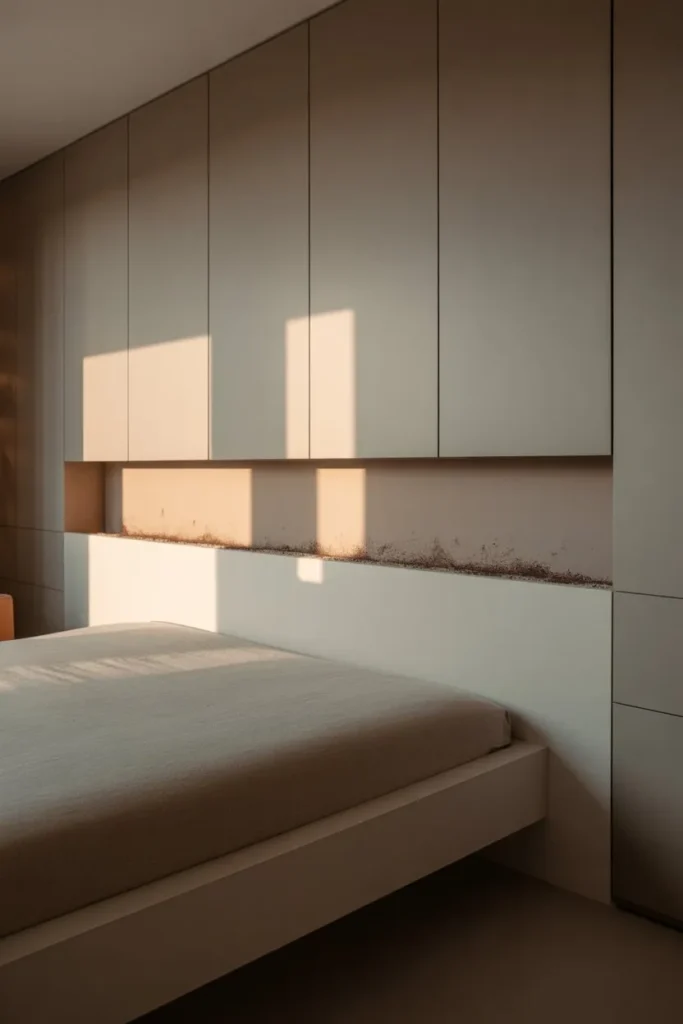
Most walls are treated as one continuous surface, but breaking that visually using height can make a small apartment feel more structured. Instead of adding multiple objects, divide the wall into two subtle zones. The lower section interacts with furniture, while the upper section stays intentionally lighter or nearly empty.
In real use, this often means placing one grounded element slightly below the typical eye level. It could be a low-mounted panel or compact piece that visually connects with a bed or sofa. The upper space remains open, allowing light to spread more freely. During the morning, sunlight tends to sit longer in the upper section, while the lower part stays slightly muted.
Over time, the lower area naturally picks up more wear. You might notice faint scuff marks, especially near seating. Dust settles more along the transition line between the two zones. These small details actually reinforce the separation rather than ruining it.
This approach works especially well in apartments where ceiling height is limited, because it creates the illusion of vertical breathing space without adding clutter.
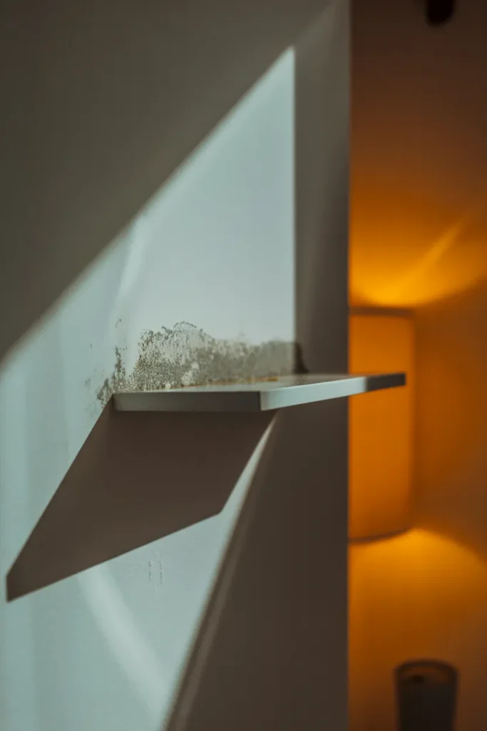
2. Edge-Aligned Minimal Placement Instead of Centering
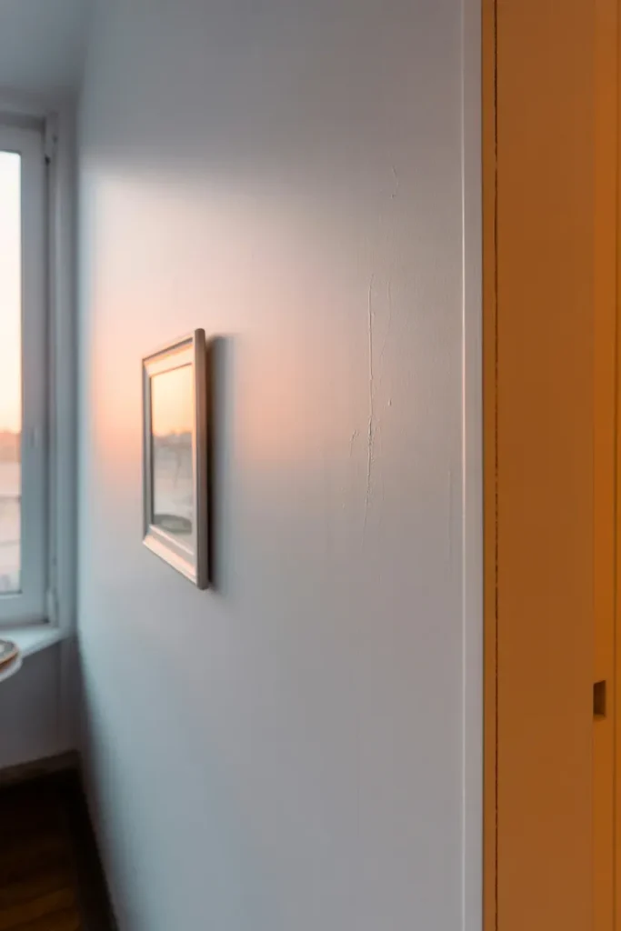
Centering is the default choice, but in smaller apartments it often makes the wall feel boxed in. Shifting a single element closer to one edge creates a more open flow across the room. It also leaves space for light and shadow to move more freely.
When placed near an edge, the object interacts differently with surrounding surfaces. One side feels anchored, while the other side opens up. In daylight, especially from a nearby window, you will notice a gradient forming across the wall. The side closer to the light appears brighter, while the opposite side fades slightly.
The alignment does not need to be mathematically perfect. In fact, a slight miscalculation often looks more natural. Over time, small imperfections become visible. You may see faint marks where adjustments were made, or slight uneven spacing between the object and the wall edge.
At night, artificial lighting creates a tighter shadow on the inner side of the object, making the off-center placement more noticeable. This subtle imbalance keeps the wall visually active without adding more pieces.
If you are working with empty wall setups, this technique pairs well with leaving surrounding space untouched for a cleaner look.
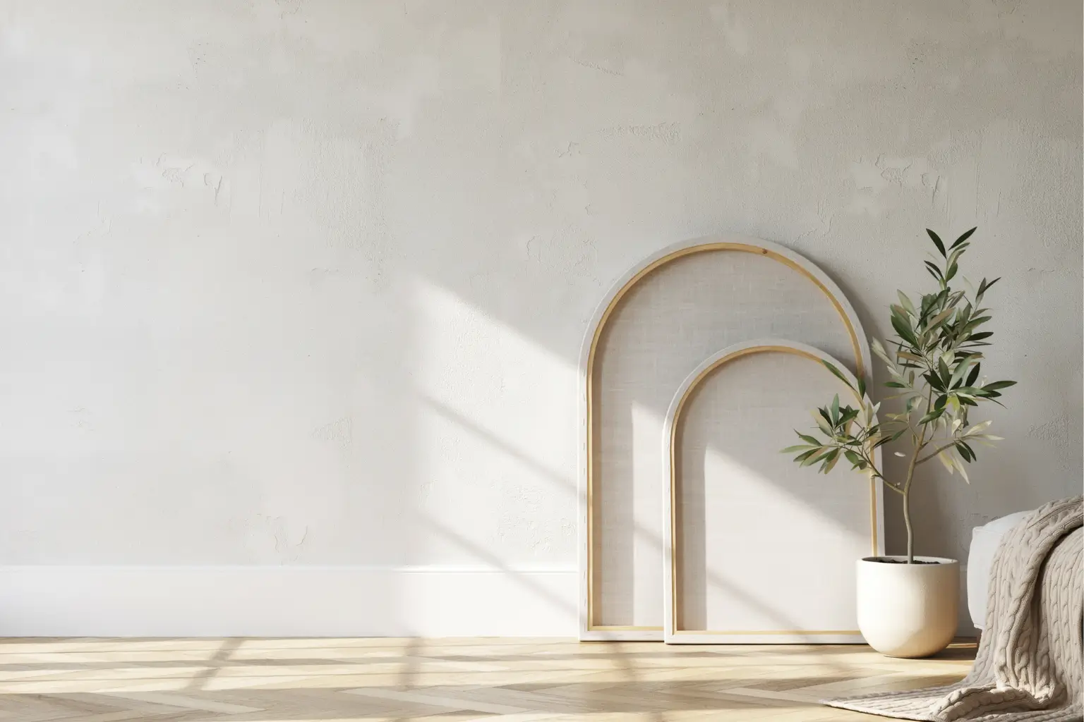
3. Lean-and-Layer Minimal Setup Without Mounting
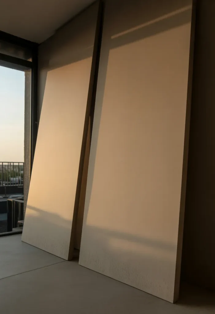
Mounting is not always practical in apartments, especially rentals. A lean-and-layer approach solves that while still creating depth. Instead of hanging items, place one larger piece at the back and a slightly smaller one overlapping in front, both resting on the floor or a low surface.
The layering does not need to be precise. In fact, slight overlap inconsistencies create a more relaxed feel. The back piece may not sit perfectly flat against the wall, leaving a narrow gap where shadows collect. The front piece might shift slightly over time, especially if the floor is not completely even.
In the morning, light enters between the layers, creating thin shadow lines that change as the day progresses. By evening, the shadows compress and become softer, blending the pieces together visually.
You will also notice small real-life details. Dust tends to gather between the layers, and the bottom edges may show minor wear from contact with the floor. These imperfections make the setup feel grounded rather than staged.
This approach is especially useful if you want flexibility, since pieces can be moved or replaced without leaving marks on the wall.
4. Narrow Vertical Strip That Breaks Horizontal Flatness
Apartment walls often feel wider than they are tall, especially in compact layouts. Introducing a narrow vertical element can interrupt that horizontal stretch and make the space feel more balanced. The key is to keep it slim and intentional rather than turning it into a dominant feature.
This could be a thin painted strip, a vertical panel, or a subtle material change. When placed slightly off-center, it draws the eye upward without overwhelming the wall. In natural daylight, one side of the strip tends to catch more light, creating a soft edge highlight while the other side remains muted.
The strip does not need to be perfectly straight. Slight waviness or uneven edges often become visible when light hits at an angle. Over time, you may notice minor discoloration or dust settling more along one edge.
Because the element is narrow, it allows the rest of the wall to remain open. This balance makes the room feel less compressed, which is important in smaller apartments
5. Floating Minimal Object with Deep Shadow Gap
Instead of placing something flush against the wall, use a small object that sits slightly away from it, creating a visible gap. This gap becomes the main visual feature because of the shadow it produces.
During the day, soft light fills part of the gap, creating a gradient from light to dark. At night, the shadow becomes sharper and more defined, almost outlining the object. This gives the wall depth without adding multiple elements.
The object itself can show small signs of use. Fingerprints on smoother surfaces, slight dust along the top edge, or even minor tilt from installation all contribute to a more realistic look.
The wall behind it may also develop subtle marks over time, especially if the object shifts slightly. These details are usually only noticeable up close but add authenticity to the setup.
This idea works well when you want something minimal but still visually interesting from different angles.
6. Bare Wall with Controlled Light Reflection Zones
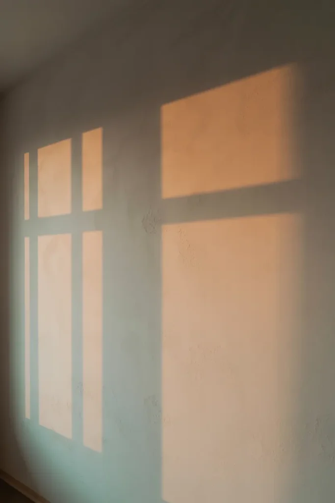
Sometimes the most effective minimalist approach is not adding anything at all, but controlling how light interacts with the wall. Position furniture, lamps, or reflective surfaces so that light creates soft variations across the surface.
In the morning, you may see uneven brightness spreading from one side, especially if light enters through a window at an angle. By afternoon, the wall may appear flatter, while evening lighting introduces warmer gradients.
Because there are no objects, small imperfections become more noticeable. Faint roller marks, slight differences in paint absorption, or subtle dents can appear depending on the angle of light. Instead of distracting, these details add quiet texture.
You might also notice how shadows from nearby objects drift across the wall throughout the day. This creates movement without requiring decoration.
This approach is especially useful in very small apartments where adding objects can quickly feel overwhelming.
Conclusion
Minimalist wall décor in apartments is less about adding and more about controlling. Placement, spacing, and how elements interact with light often matter more than the objects themselves. When done right, even a nearly empty wall can feel complete.
What makes these ideas work is their flexibility. They allow for small imperfections, gradual changes, and real-life use without losing their impact. Instead of trying to perfect the wall in one step, it is more effective to build it slowly and observe how it behaves throughout the day.